Block reference
This page lists every block type in the palette and the design variants available for the blocks that have them. A variant is purely a different look — the same content rendered another way — so switching one never changes or loses your content.
Block types
Section titled “Block types”Content
- Heading — a section heading.
- Text — rich text (headings, lists, bold / italic / links).
- List / Bullets — a bulleted or numbered list.
- Statement / Callout — a highlighted statement.
- Divider — a visual separator.
- Continue — a page break that gates progress within a lesson.
- Button — a labelled button.
Media
- Image — a single image, with size and alignment.
- Image + Text — an image paired with text, with an image-size control.
- Gallery — a set of images.
- Audio — an audio clip.
- Video / Embed — an uploaded video or a YouTube / Vimeo embed.
Interactive
- Accordion — collapsible sections.
- Tabs — tabbed panels.
- Click-to-reveal — content revealed on click.
- Timeline — a sequence of events.
- Modal — content opened in a dialog.
- Check-for-understanding (CFU) — an inline knowledge check with radio options and Submit.
- Flashcards — two-sided cards.
The CFU and Flashcard blocks come from the EDZLMS interactive-content library.
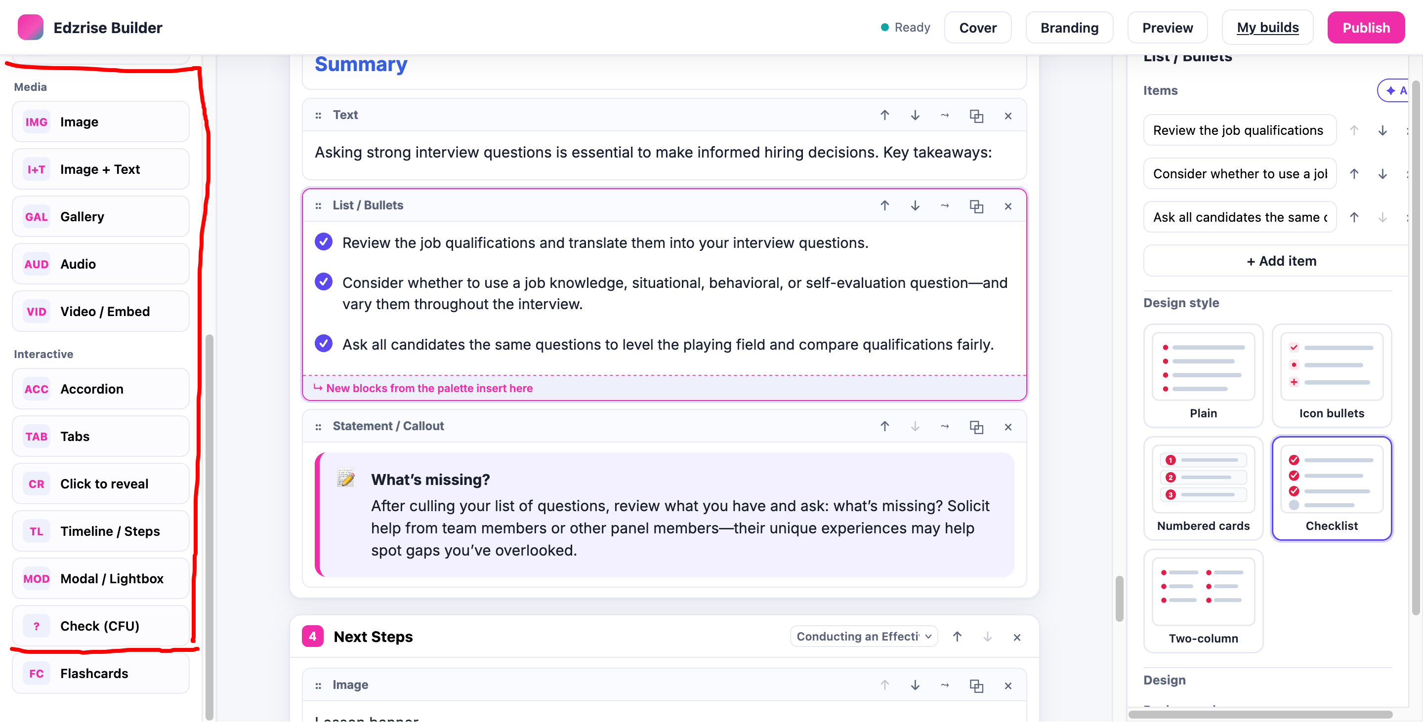
Design variants
Section titled “Design variants”Authors pick a variant from a thumbnail grid in the block’s settings. The same variant renders identically in the editor canvas, the preview, and the published SCORM player.
| Block | Variants |
|---|---|
| Accordion | plus/minus right · arrow left · numbered · separated cards · flush |
| Tabs | top · left rail · bottom strip · clickable boxes · tab with image · process stepper (numbered prev/next panels) |
| Gallery | grid · carousel · masonry · lightbox thumbnails · full-bleed slideshow |
| List / Bullets | plain · icon · numbered cards · checklist · two-column |
| Statement / Callout | info · note · quote · warning · big |
| Flashcards | flip on click · flip on hover · grid · image front · carousel (one card + prev/next + counter) |
| Image + Text | image left / text right · text left / image right · text over image (left) · text over image (centered) |
| Cover page | full image + overlay · image left / text right · image right / text left · color block · centered |
The tab with image and flashcard image front variants accept an uploaded image (or a URL) in the block’s settings.