Authoring lessons
This guide covers the editor itself: how a build is structured, how to add and arrange content, and how to set the cover and branding that apply to the whole build.
How a build is structured
Section titled “How a build is structured”A build is a sequence of lessons. Each lesson is a stack of blocks, and lessons are grouped into sections. Learners move through them in a paged, Rise-style reader with a table of contents, progress rings, and “continue” gating.
Add and arrange blocks
Section titled “Add and arrange blocks”Open the block palette and drag a block onto the canvas. Once a block is placed you can:
- Reorder it with the ↑ / ↓ controls, or drag it — including between lessons.
- Duplicate or delete it from its toolbar.
- Move it to another lesson using the “Move to lesson” menu on its toolbar.
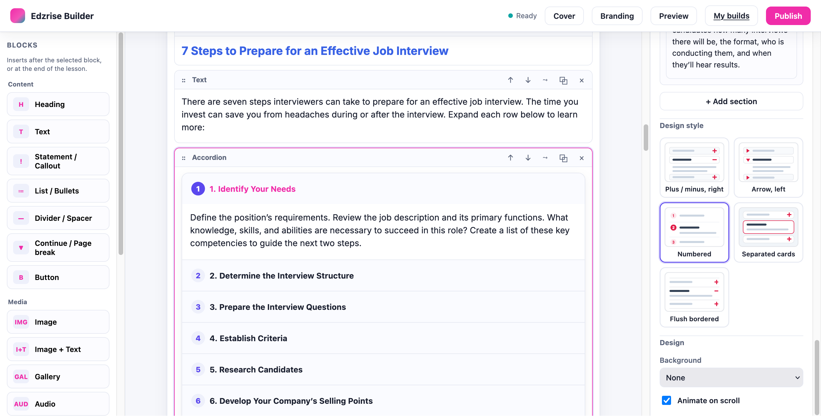
- Nest blocks where the block type supports it.
Select any block to open its settings panel on the right, where you edit its content fields and choose its design.
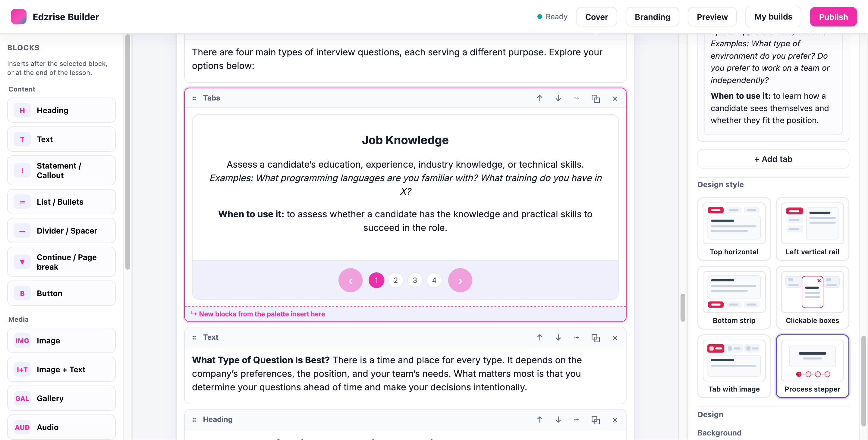
Design variants and per-block design
Section titled “Design variants and per-block design”Most blocks offer several variants — alternate looks for the same content, chosen from a thumbnail grid in the block’s settings. Switching a variant never changes or loses your content. Each block also has a Design section for a background tint and an animate-on-scroll option. For the full catalogue of which blocks have which variants, see the Block reference.
The media library
Section titled “The media library”Upload and reuse images, audio, and video within the build:
- Images have a size (full / large / medium / small) and an alignment (left / center / right).
- The Image + Text block has an image-size control that sets how much width the image takes versus the text.
Media you upload is bundled into the published package, so the SCORM works offline.
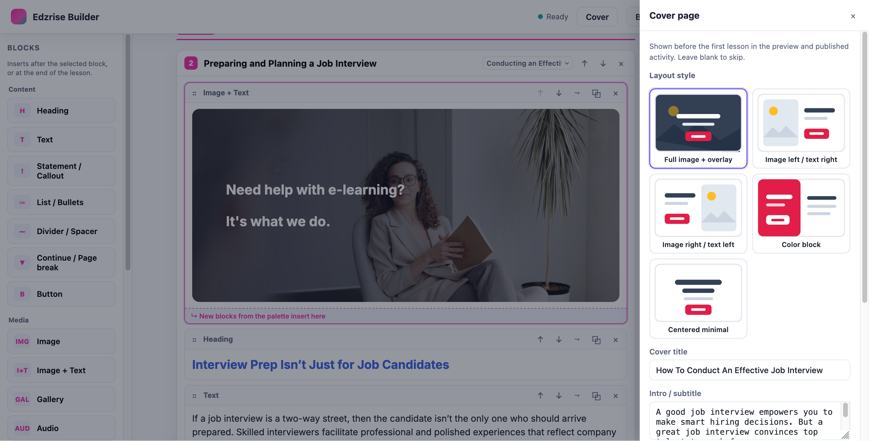
From the top bar, open Cover to set the course cover page that learners see first:
- A cover title and an intro / subtitle.
- A course description — a longer paragraph shown on the overview page, above the lesson menu.
- A hero image.
- A cover layout style (five options).
Branding
Section titled “Branding”From the top bar, open Branding to apply a consistent look across the whole build — the editor canvas, the preview, and the published player all use it:
- Colours — primary / accent, plus title, body, sub-text, and button colours, and a button style.
- Font — System sans, Inter, Poppins, Rounded, Serif (Georgia), Lora, or Roboto.
- Text spacing / line-height — Compact, Cozy, or Roomy.
Preview and autosave
Section titled “Preview and autosave”Select Preview to render the build with the same player used at publish — the cover overview, the lesson menu, the sidebar search, and the paged reader. What you see is what the learner gets.
Your work autosaves continuously and is versioned, so a reload never loses changes. The status indicator reads “All changes saved” when everything is persisted.